- Role
- Graphic Design · Branding
- Website
- sorapink.com
- Date
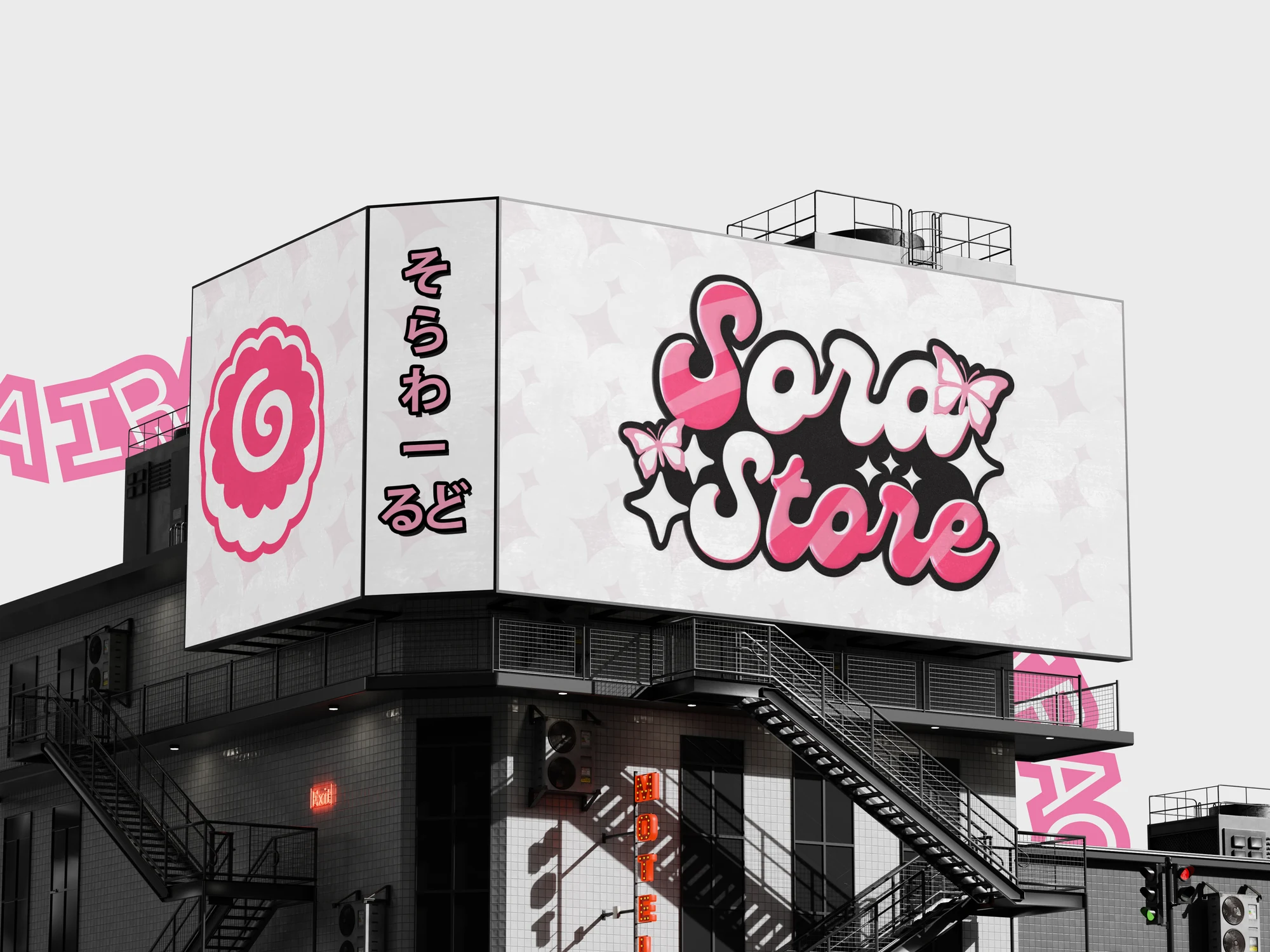
Sora Store, an Iraqi brand for youth clothing with a kawaii-leaning look.
The name
Before we get into the design, there is one thing we need to understand: what does "Sora" mean?
Sora is an original Japanese word. It means "the sky", or "space".
In Japanese, the name Sora is written mainly with one system:Hiragana
Japanese people use Sora a lot. The meaning is soft and natural, it points at the sky, it isn't tied to a gender, and it is easy to say: two syllables only, So-ra. That is what made it such a common name there.
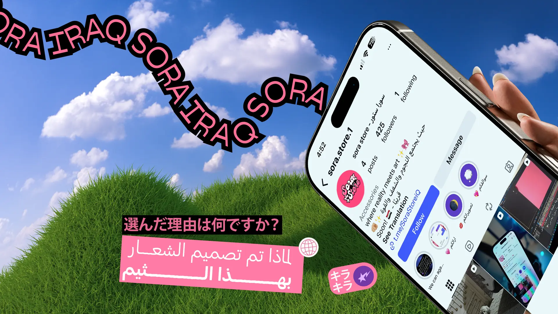
Now, the philosophy behind the logo
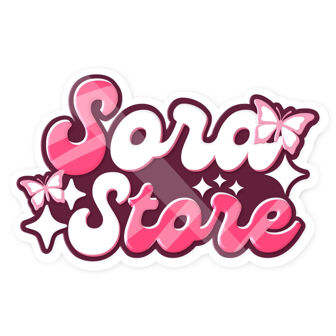
The butterfly stands for lightness and warmth. It follows the meaning of the name: Sora is the sky, and butterflies move through the sky freely. That is the spirit of the project, an easy and spontaneous relationship with customers, and a look made almost entirely for women.
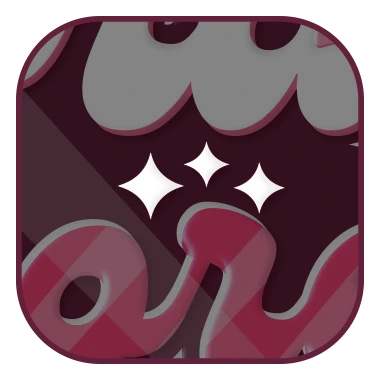
The stars are not only there to look pretty. Stars live in space, and part of what the name means is the sky, and past the sky comes space. That is where the stars came from.
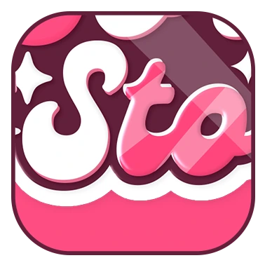
The typeface and the way its letters are drawn follow the softness of the name, in how it sounds and in what it means.
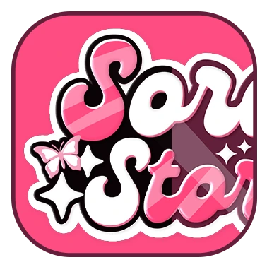
The logo runs on more than one colour arrangement, all of them inside a circle drawn between pink, black and white, with no strict rule. So the mark can appear in more than one theme at the same time, wherever it is needed.
That is how the idea of the Sora logo came together: a mix of several things, each one carrying the meaning of the name and the purpose behind the mark.
Colour palette
Two primaries carry the brand, and white is the space they breathe in.
- #FF4D82
- #000000
Fonts
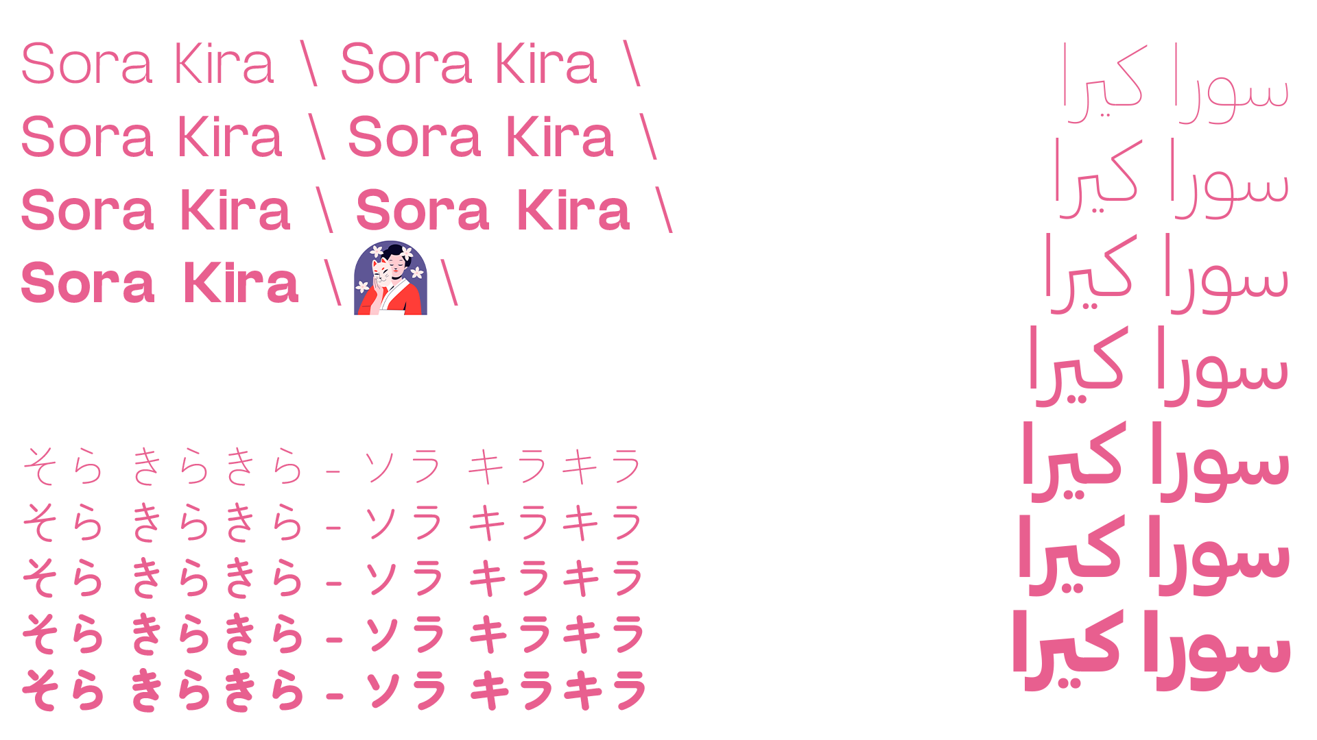
Print design
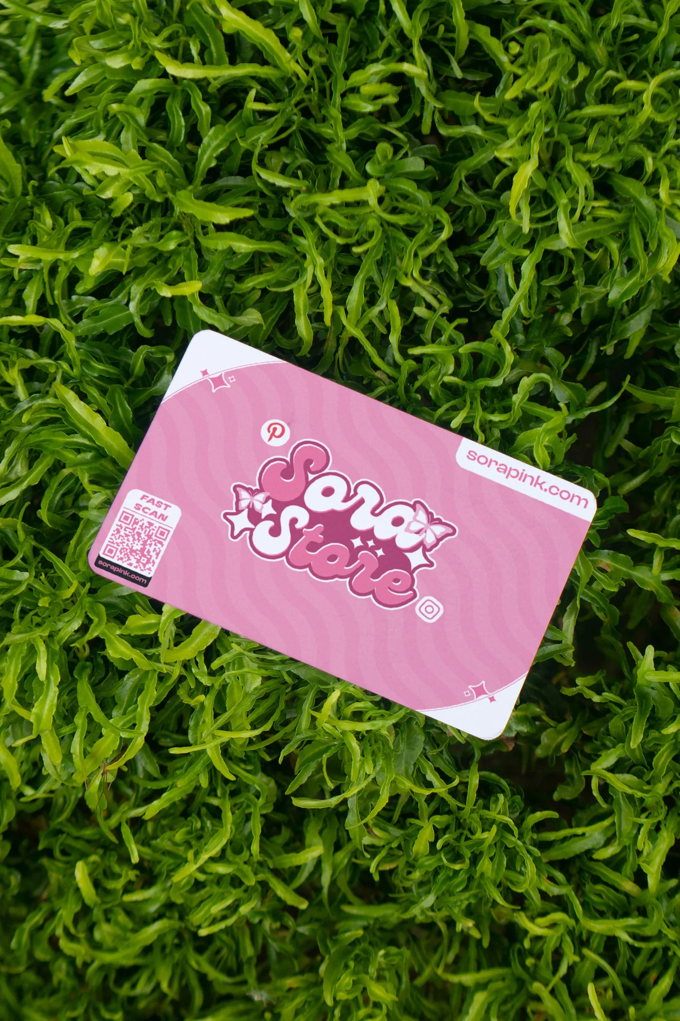
The idea behind the printed material was simple: the logo had to hold up on real objects, at real sizes.
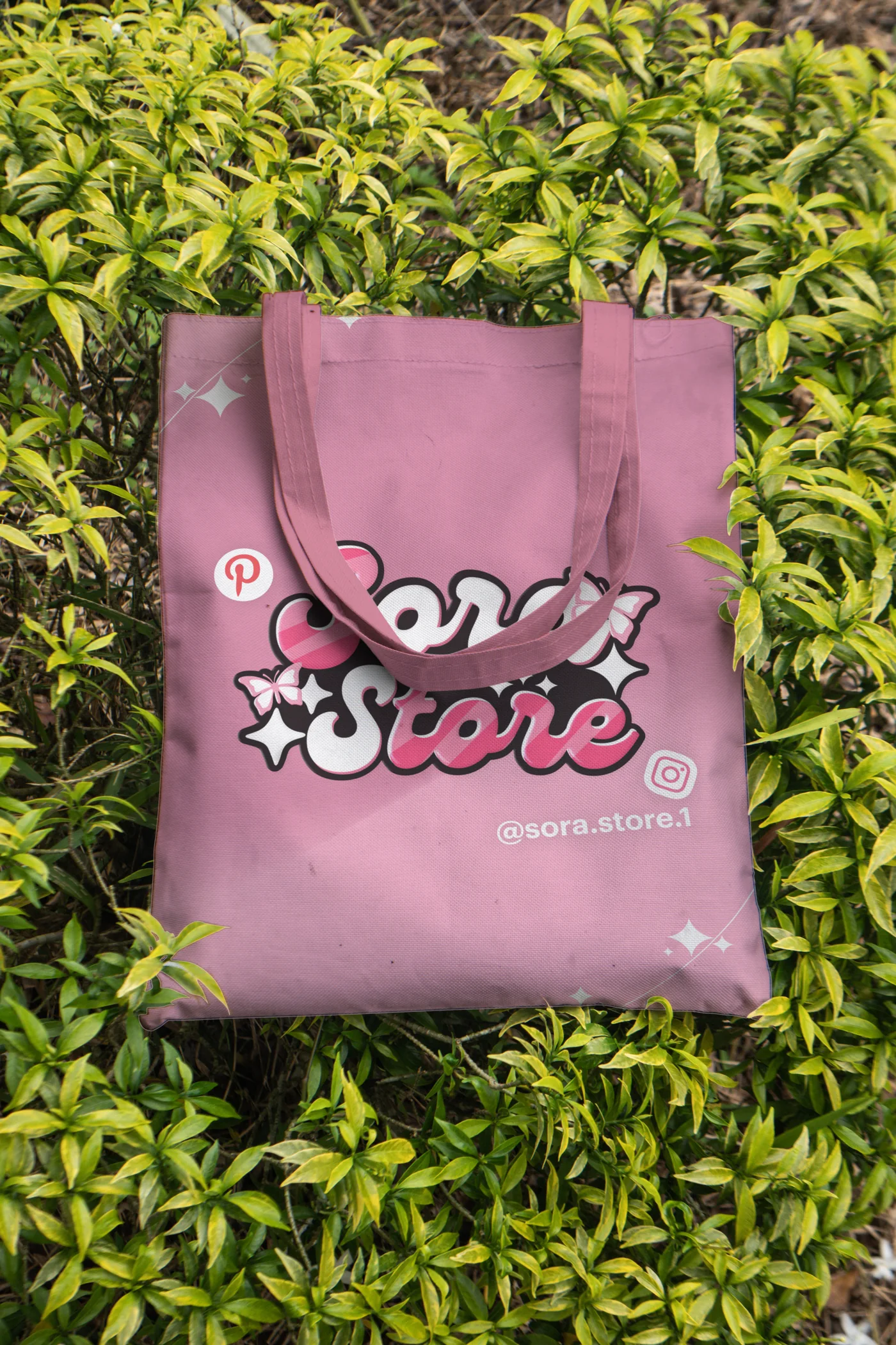
These mockups are not print-ready files. They are here to show how well the logo sits on most printed material.
Scope
- Branding
- Graphic Design
- Logo Design
- Print Design